The Illegible and the Interface
Another conference paper (given two or three times) from the vaults that never went anywhere more productive. I don’t know what happens at the end. So many of these papers just sort of trail off. The session must have been starting and I had to “finish” writing.
————————————————-
Derrida, in Dissemination: “a readability without a signified (which will be decreed to be an unreadability by the reflexes of fright)” (253)
Claus Bremer – Untitled
In an early critical evaluation of concrete poetry, RP Draper writes:
In European printed language it is an automatic assumption that letters forming words are separated by space from other letters forming words, that these letters march across the page from left to right, and that the lines so formed are strictly parallel and progress downwards at equal intervals. Concrete poetry plays upon these expectations, but itself takes nothing for granted.
Among his many examples of this “taking nothing for granted, Draper notes that the spacing between words may be erased, as in Ilse and Pierre Garnier’s “cinema”, shown here
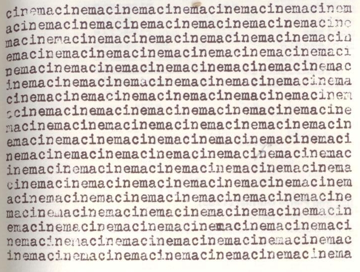
Ilse and Pierre Garnier – “cinema”
[Sorry for the quality of the scan]
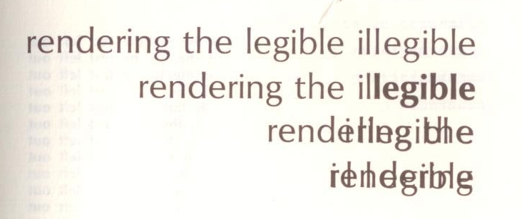
Similarly, line spacing may be eliminated, or we may witness the systematic emergence of a single word, or of even a single letter. And yet, for all his acknowledgment of what concrete poetry attempts to do, Draper falls into what we must recognize as an all too often unthought mistake with regard to the interface of eth printed page. He argues that in what might be called “’pure’ concrete poetry the spatial element is essential to the communication, not merely something additional.” Spatiality is, for example, something merely additional in “Il Pleut,” in which Apollinaire “arranges his text in drifting vertical lines to suggest visually the effect of falling rain.” Similar to Dickinson’s early editors, who understood their imposition of traditional line breaks and stanzaic form on her poetry to be neutral, Draper notes of “Il Pleut” that “the poem could be conventionally as verse with scarcely any damage to its meaning.”
Even more strikingly, Draper argues that concrete poems devolve into the merely graphic when they “treat letters as simply materials for composition.” His moral imperative: “In some manner the spatial elements of the poem must do the work of traditional syntax and articulate the meaning that lies dormant in words.” Draper makes clear that at stake here is a question of legibility, or the reader’s ability to make sense of what the poet is trying to communicate (the vocabulary is his). For the poet to give in to her “facility for making pretty patterns” would afford the reader only a sense of an “ingenious doodling” from which she learns nothing.

All theories proven with one graph
Thus there is a problem of here of reading, on one level, the content, and on another, the form through which the content is transmitted (although I do not mean to separate content from form or information from medium of transmission—in fact, this paper continues a tradition of arguing against such a distinction). The problem of how best to communicate content—of how to shape data, statements, utterances into a usable form—is of course, an old one. This graph demonstrates that what is legible may not communicate very much, at least not in the sense that we as teachers would like to communicate clear and precise sets of information. Of course as any reader of Edward Tufte will know, visual data (a category in which I include what we traditionally define as writing) is not meaningful (or better, useful) until it is presented in a legible fashion. And let me note that in Tufte and other like-minded theorists of information design, we arrive at legibility through an understanding of information’s requirements (different data points have different requirements, natch). Unfortunately, these requirements are often measured against the needs of the audience (and let us not forget that the construction of audience is a function of literacy, through which we get the legible). The reason this measurement is unfortunate, is that it precludes telling the audience anything new beyond the content of the form.
While this paper is somewhat theoretical, I am most concerned here with the pedagogical implications of how we all too often assume that the proper interface will render content legible. At a 2008 conference I had the chance to here Nobel Laureate Carl Wieman talk about teachers’ too-eager approach to the use of technology in the classroom. For Wieman, the question that must be asked but rarely is: what problem does the pedagogical use of technology actually solve? At the close of his talk I asked Weiman about textbooks as technology, about the fact that if we don’t often ask about what we hope to accomplish by our use of new interfaces in the classroom (WebCT, Georgia Tech’s TSquare wikis, blogs, chat, etc), we never question the status of the printed codex book as a means to communicate content. We are very quick to identify and appropriate new interfaces for classroom purposes; these technologies are meant to help students get to the content of our courses, the information we would like them to understand and retain.
The problem with this approach, I think (and it seems Wieman agrees with me, for what it’s worth, even if he did not have a response to the problem of the textbook as technology), is that we then understand information (or, worse, knowledge), as something that is abstract, but of course, not abstract enough; this is to say that we do not always recognize the interfaces through which we come to information, for example the textbook, an interface which is of course, when taken in its specific instantiations, not neutral (just as WebCT itself is not neutral; if it was neutral, we would most likely not find it at all useful). In so doing, we fail to think through the underpinnings of our processes of constructing legibility. We must consider the interface as more than that which reveals a thing that is always already legible. Thus, while comical, the graph presented here does make an important point I think, namely that we should not understand the fact that it is legible as an interface—we can see that it is a graph, we can read it as an interface to a potential content—to mean that it is in fact communicating anything to us beyond itself as an interface. In other words, we should not rush to use such graphs in the classroom. In all seriousness, we can consider this graph an inversion of the problem Wieman presents, that given what we assume to be a coherent content, legibility can be achieved on the level of interface.
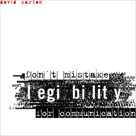
David Carson – Don’t confuse…
It is not coincidental that Wieman framed his talk in terms familiar to students of design (graphic and otherwise), that is, in terms of solving a problem. Of course, certain graphic designers such as David Carson seem to create more problems than they solve, or perhaps solve problems we don’t even know we have.
Pierre Garnier claims that those poetries that fall under the general classification “objective”—concrete, phonetic, visual, phonic, cybernetic, serial, permutational, verbophonic—“abandon the robot languages to their sleeping existences” and
escape from the old social order and from the storehouse of available ideas which has remained unchanged for thousands of years, and in which all revolutions are engulfed and lost. For example: the Indo-European languages which are based on the same substructure of subject-verb-object, in which to our day a way of life has been arrested.
Similarly, in A Thousand Plateaus, Deleuze and Guattari write:
Even when linguistics claims to confine itself to what is explicit and to make no presuppositions about language, it is still in the sphere of a discourse implying particular modes of assemblage and types of social power. [. . .] you will construct grammatically correct sentences, you will divide each statement into a noun phrase and a verb phrase [. . .].
As we saw in Draper, and as Carson illustrates, the imperative to create something that communicates, something that can be read, something legible, does not end with syntax, does not end at the level of the linguistic interface. It also extends to the printed page, with its rules, its justifications if you will.
Henri Chopin draws our attention to the morality of these conventions in his critique of the Word (capital W). Chopin accuses it of imposing an order “which everybody uses indiscriminately, always for the benefit of a capital, or a church, or a socialism, etc.” The Word, he argues, “is responsible for the general incomprehension of beings who succumb to murders, racisms, concentrations, the laws, etc.” It is responsible because “instead of making it a way of life we’ve made it an end. Prisoner of the Word is the child, and so he will be all his adult life.” Finally, “I accused it and I still accused it as an impediment to living, it makes us lose the meager decades of our existence explaining ourselves to a so-called spiritual, political, social, or religious court.”

Dickens – Great Expectations
Chopin’s mention of a court may be coincidental, but perhaps not, for such a juridical context raises the question of justice. We should not be surprised therefore to recall that the term justify can mean
- To administer justice to; to try as a judge, to judge; to have jurisdiction over, rule, control, keep in order; to do justice to, treat justly.
- To maintain as true, affirm, aver. Obs.
- c. To render lawful or legitimate. Obs.
As well as
- To make exact; to fit or arrange exactly; to adjust to exact shape, size, or position. Now only in technical use; esp. (Type-founding), To adjust a ‘strike’ or ‘drive’ by making the sides level and square, and keeping the impression at the proper depth, so as to form a correct matrix; (Printing) To adjust types of smaller and larger bodies together, so that they will exactly fill up the forme; to space out the line of type in the composing stick properly.
Print conventions are thus related to larger questions of law and morality, and thus are quite consonant with the phrase “thou shalt”.
But what are we to do when we are confronted with something that defeats our conventional cum natural expectations of the perfectly legible text? Consider, for example, the following experiment from David Carson.

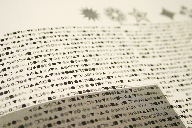
Dingbats
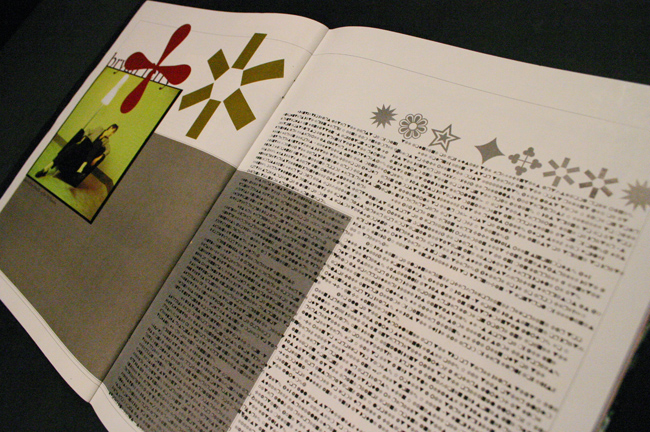
We are all familiar with wingdings, sets of symbols that correspond with letters, numbers, etc first developed by Microsoft in 1990 and frequently used as “printer’s ornaments. “The development of this font corresponds to the rise of the personal computer and the revolution in graphic design the computer would afford. This revolution afforded so-called “mac-jockeys” such as Carson an endless number of typefaces upon which to draw, and seemingly freed them from the certain constraints of form in the manner that photography freed painting from representationalism. While Carson had been at work destroying conventions of print in the 1980s while at Transworld Skateboarding. However, once he moved to Ray Gun in the early 90s, he really began to make an impact.
David Carson – Interview with Brian Ferry set in wingdings
One of Carson’s most famous (or notorious) of his experiments in legibility came in 1994, when he set what he felt to be a very boring interview with Bryan Ferry entirely in Zapf Dingbat, a Wingding-style typeface. That what is normally known as ornamentation is here used to signify is interesting, although what it signifies is the graphic designer’s boredom with the interview so rendered. Here is a detail of the interview in Dingbat.
Carson – Another view of the Ferry interview
Clearly, Carson does not work within the justice system. Other experiments, such as the earlier poster which tells us not to confuse legibility with communication, challenge us to understand what we understand when we experience what we assume to be the neutral print interface. However, as interesting as this particular experiment is, Carson undercuts himself by
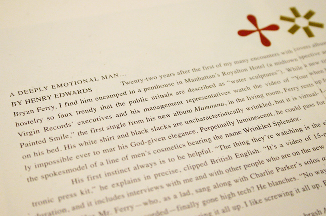
Carson – The Ferry interview set “properly”
1) including the interview a second time at the end of the issue, rendered now in a conventional typeface; 2) that here we have not so much a question of legibility but of cypherability; the code is, after all, rather simple; and 3) because, despite his other experiments, this one does not question any print convention beyond that of the set of marks used to communicate.
I meant to have a slide here of Canadian poet BP Nichol’s “Complete Works,” a concrete poem that is simply the line-by-line reproduction in print of all the keys on a standard QWERTY typewriter, circa 1965. Nichols’ point, of course, is that all potential poems are contained therein. Nichol himself would go on to challenge this point through his sound poetry, his experiments with digital poetry (he wrote one of the first computer poems, in Hypercard, “First Screening”, in 1984), and other graphical experiments. However, this experiment by Carson, again while interesting, seems to rest on a logic of the conventional page and even of the convention of a stable set of symbols for the purpose of communicating. It is almost as if he took a page from Draper and stated, experiment is okay, but let’s not get carried away here.
I do not mean to knock Carson, as he remains one of the most innovative graphic designers in the world even now. But this particular experiment pales in comparison, it seems to mean, with texts constructed forty or fifty years ago.

Ronald Johnson – Untitled

Vaclav Havel – Estrangement (detail)
For example, consider this text by Ronald Johnson. In a certain respect, this text reminds me of Nichols’ “Complete Works” in that it is entirely constructed out of standard letterforms, albeit not those found on common typewriters (perhaps this is not even a fully developed typeface). However, what this poem does is only in part dependent on letterforms as units of semantic meaning. In fact, that may bee the least interesting aspect of the poem. Rather, this text conveys information about the letterforms themselves, and the manner in which printed letters convey information about the set to which they belong. The “M” is an upside-down “W”. The “M’ width is rigidly enforced, even unto the capital “E”, which is rendered somewhat strange. The point on the capital “A” is shown to potentially nestle in the “W”, which is also an “M.” Johnson’s poem makes us aware of the materiality of each letter, of the maze of information the set contains, of the genetic connections each one has with the others. When we read this poem, we are not reading a standard legibility, we cannot (only) read according to the conventions print enforces.
h n u d b
[not the original slide, but it gives a sense]
Nichol himself was fascinated with the letter “H”, and no wonder. The lowercase “h” contains a great deal of information about the complete typeface to which it belongs. Here are four fairly common typefaces, and a demonstration of the connections the letters share with one another. (You will notice that the captions to many of these slides are set in Verdana, the legible typeface par excellance in the digital age.) When viewed in the context of the legibility I am critiquing here, we notice that there is a logic to print-as-interface that we are not inclined to see or interrogate. There is an imperative write grammatically correct sentences, but we must also justify our letters, words, sentences, and paragraphs.
[sorry, i can’t find the slide that went here but it gave examples of common typefaces including Helvetica, Verdan, Courier, and Times New Roman]
When we look at typefaces in this manner, we are in a position to think through the logic they enforce.
Of course, such experiments as Johnson’s are limited. I don’t make this point to critique so much as to acknowledge. How could they not be? So let’s look at one more example of the illegible, or what we a-legible or perhaps the differently legible.

Vaclav Havel – Estrangement
Vaclav Havel – Estrangement (detail)
Vaclav Havel’s “estrangement” also demonstrates a connection between letterforms, although here it is not the relationship that comes from belonging to the same typefaces (the capital “A” and capital “J” share information with each other, but it is not at all of the same quantity or quality of the sharing between the “h” and the “n”). Here, the convoluted path (comprised of something like 62 turns) that the first letter of the alphabet takes to the tenth suggests a critique of the logic that the alphabet has a proper order. Our keyboards do not conform to this order, for example. Where does this order come from? The song? That Havel makes use of the first and tenth letters of the alphabet implies a connection to a base-ten mathematical system, a system that letters know nothing of.
What these texts suggest most of all is that questions of legibility and readability are complex. More, they demonstrate that legibility is not natural. As Craig Dworkin notes, with regard to the illegible texts he “reads” in Reading the Illegible: “That I am able to read these works at all—as poetry—is not a historical accident. Equally contingent are all of the particular interpretations I have proposed”. We can read Dworkin as saying that poetry as a form is a historical object and the ability to read a text as poetry (or as textbook) can only occur after the advent and reification of the form. Dworkin: “The complex mechanisms by which make a work generically legible are neither obvious nor direct, but their operation is worth considering even if it cannot be explicitly traced—even if its processes remain, to some degree, entirely illegible” (150). Whether the form of poetry is the most legible form through which the information contained therein can be communicated is impossible to determine after we determine that poems are, in fact, legible, that is, until we introduce an illegible form that forces us to reexamine our assumptions about legibility.

Leave a comment